Friday, April 23, 2010

Classed Choropleth Map

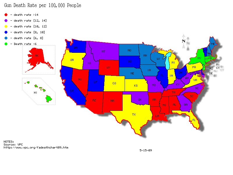
Classed Choropleth Maps use specifically delineated scales to show the occurance of a variable on the map. This means that numbers which are not equal may appear with the same color depending on whether or not they fall within the same “class” or range on the scale, as seen on the map of gun-related death rates in the USA


http://gunlawforum.files.wordpress.com/2009/05/gun_death_states1.gif

Nominal Area Choropleth Map


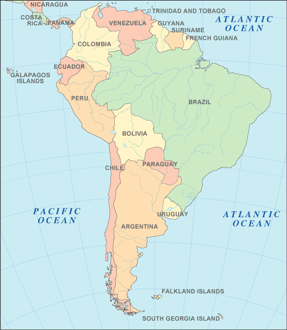
Nominal Area Choropleth Maps depict arbitrary data over a region that is otherwise difficult to classify otherwise. National borders are an excellent example of this.


http://www.world-atlas.us/south-america-map.gif

Index Value Plots


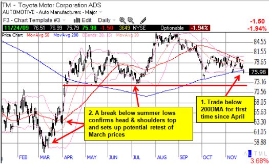
Index Value Plots are simple graphical depictions of a line on a graph derived from a body of data via a mathematical equation. It is, in short, an indexed graph. This graph of Toyota is a set of indexed values that makes sense to stockbrokers.


http://drduru.com/onetwentytwo/wp-content/uploads/2009/11/091124_TM.jpg

Population Profile


Population Profiles show the range of certain variable or set of variables across the population. This is an age-based population profile of immigrants entering the United States.


http://www.populationaction.org/Publications/Reports/The_Shape_of_Things_to_Come/asset_upload_file420_6098.gif

Triangular Plot


Triangular Plot: These plots allow three variable to be plotted against each other, eliminating the necessity of comparing multiple more conventional plots. This plot shows the relative mental stability and resulting state of several Batman characters.


http://cdn-www.cracked.com/articleimages/ob/tragedy_wm.jpg